13 Federal Reserve charts outlining the accomplishments of Obama’s economic recovery that Donald Trump will have to deal with.
Higgins News Network
Back in July, the Washington Post claimed to debunk 9 charts that Donald Trump tweeted which were presented presented by Zero Hedge to illustrate the accomplishments of Obama’s economic recovery.
The Washington Post took up the task of “fact checking” the charts because Zero Hedge didn’t source the charts with an officially approved source of Government propaganda.
Given the corporate media has recently waged a “fake news” war to discredit the alternative media, and that Donald Trump has since won the election and now has less than 50 days before taking office, those 9 charts along with two more are presented each created directly using the Saint Louis Federal Reserve’s website using official Federal Reserve’s data.
Each chart of Obama economic accomplishments are presented containing a water mark sourcing the official Federal Reserve chart data and a live hyperlink below the chart so that there are no discrepancies about the authenticity data.
These links reference updated official data for the charts, Zero Hedge reported in July and to further show that the Washington Post’s so-called “fact-checking” was just one of thousands of liberally biased “fake news” articles published by the corporate media during the election.
Updated versions of the charts of Obama’s accomplishments, along with charts of two additional accomplishments, follow below sourced directly using Federal Reserve data.
These are all accomplishments President Trump will struggle to beat throughout his administration.
Zero Hedge reported in July.
These Are The 9 Zero Hedge Charts Showing “Obama’s Recovery” That Angered The Washington Post
As regular readers know, one of our favorite chartpacks to show “Obama’s recovery” is the one below, presented most recently just two days ago during Obama’s now almost weekly televised sermon of how the economy is great and anyone who disagrees is “peddling fiction”, which using simple Bloomerg data, summarize recent changes in key economic indicators including soaring federal debt and government dependency via food stamp use, surging healthcare costs and social inequality, plunging homeownership, income, and labor force participation, and – of course – driving it all, none of the president’s or Congress’ actions, but the Fed’s balance sheet, something even major banks admit is better known as “printing money” – money that ends up blowing one after another asset bubble unable to finds its way into the broader economy – a stigma that is now gone in a world in which helicopter money is seriously considered by lunatics in power.
To be sure, the charts do not in any way imply that Obama started any of these disastrous trends (with a few exceptions); they do however make it very clear that more than 7 years under president Obama, these same trends have not changed.
This means that while Obama may have inherited a bad economy, contrary to the endless propaganda, the economy has only gotten worse. One needs only to go on a very short drive through any of the neighborhoods of Obama’s native Chicago to get a clear realization of this sad fact (while wearing a bulletproof vest).
Then yesterday, we were pleasantly surprised to see that none other than Donald Trump used this very chart set to demonstrate a point, namely that “Obama’s legacy is an absolute disaster”, something we doubt many would disagree with.
However, one entity that would naturally be offended by nice simple charts which factually expose the failure behind both the propaganda and Obama’s attempt to jump start the economy, was Jeff Bezos’ Washington Post, an outlet which has had a long-running vendetta with Donald Trump, and, apparently, the facts.
[…]
"@TaylorEdwards99: THIS IS @POTUS'S LEGACY! AN ABSOLUTE DISASTER!!! WE NEED @realDonaldTrump NOW!! #MAGA #TRUMP2016 pic.twitter.com/lBgZJg0zd1
— Donald J. Trump (@realDonaldTrump) June 2, 2016
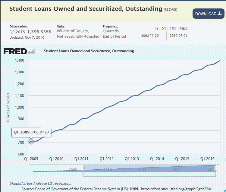
Student Loans
Student loan debt has skyrocketed, nearly doubling from $706 billion dollars to $1.396 trillion.
Source: myf.red/g/bZMr
Latest data shows that Student Loan debt now stands at $1.396 Trillion dollars.
At the beginning of the Obama administration, in the first quarter of 2009, student loans stood at $706.6 billion. From there, the graph continues to rise. By the fourth November 7th, 2016, the last date for which the Federal Reserve Bank of St. Louis charted the data, outstanding student loans owned and securitized had risen to $1.396 trillion nearly doubling in since Obama took office.
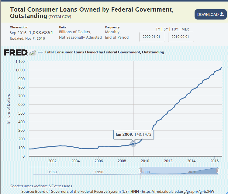
Government Owned Consumer Loans
Consumer loan debt owned by the Government has skyrocketed from, nearly doubling from $143 billion dollars in January 2009 to $1.038 trillion dollars.
Source: myf.red/g/bZHW
Government owned consumer debt, meaning the tax payer is on the hook has risen 725% since January of 2009.
At the beginning of the Obama administration, in the first quarter of 2009, government owned consumer debt stood at $143 billion. From there, the graph shows an unprecedented step rise. By the fourth November 7th, 2016, the last date for which the Federal Reserve Bank of St. Louis charted the data, outstanding Government owned consumer debt has risen to $1.038 trillion representing a 725% increase since Obama took office.
Food Stamps
Food stamps stands at $68.7 billion for the latest reported fiscal year of 2015 which is higher than any president in history.
Source: myf.red/g/bZEj
Under President Obama, the Supplemental Nutrition Assistance Program, or SNAP, commonly known as the “Food Stamps” program, has grown from $37 billion for the fiscal year of 2008 to a high of grew to an all time high of $74.9 billion in 2012.
In January 2015, the number of beneficiaries receiving food stamps topped 46 million for 38 straight months, with 14.6 percent of the population and 19.7 percent of all households receiving food stamps.
Food stamp assistance for 2015, the latest fiscal year reported by the Federal Reserve was $68.7 billion which is nearly double the amount of any other president in history.
A new USDA study shows that nearly $1 billion of food stamps is spent on junk food.
Public Debt vs US GDP
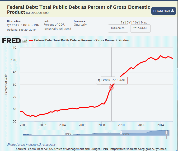
Total U.S. public debt is not greater than the entire U.S. gross domestic product.
Source: myf.red/g/2mCq
In the first quarter of 2008 public debt was already unmanageable at nearly 2/3rds of U.S. Gross Domestic Product and by the time Obama took office in 2009 the debt had risen to 77.35 percent of GDP.
Since taking office, Obama’s policies has allowed public debt to grow larger than the entire Gross Domestic product the United States.
In the second quarter of 2015, the latest period reported by the Federal Reserve, total public debt stood at 100.8% of GDP at an enormous $18.151 trillion dollars.
Federal Debt
U.S total public debt is $19.381 trillion according to the latest data reported from the Federal Reserve.
Source: myf.red/g/bZPf
In the first quarter of 2008 the total federal debt stood at $9.437 trillion dollars and rose to $11.126 trillion in the first quarter of 2009 when Obama took office.
Since then the total U.S. public debt has nearly doubled in size to $19.381 trillion as of the second quarter of 2016, the latest period the Federal Reserve has reported the data.
Money Printing
Source: myf.red/g/bZDE
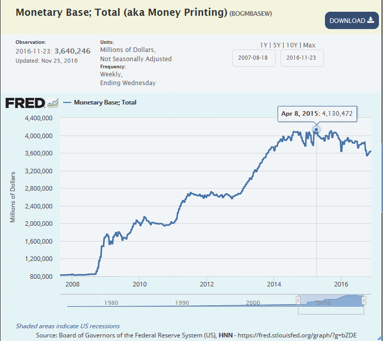
Prior to the 2008 financial collapse the U.S. monetary base stood around $850 billion.
In response to the collapse President Bush expanded the monetary base, referred to as printing money, and nearly doubled the balance sheet to $1.527 trillion on February 4, 2009 at the beginning of Obama’s first term in office.
Since then Obama, has continued to print money at an unprecedented levels, including multiple rounds of “stimulus” known as Quantitative Easing, expanding the monetary base to nearly 3 times the amount of when he took office.
The monetary base to a high of $4.13 trillion in April of 2015 and and currently stands at $3.64 trillion according to the latest data from the Federal Reserve
Health Care Costs
The price of health care has risen nearly 33% under Obama despite his promise to curb costs with the Affordable Health Care act.
Source: myf.red/g/bZJc
The Consumer Price Index (CPI) of medical costs when Obama took office stood at 369.82.
One of Obama’s core campaign pledges was to curb the skyrocketing cost of health care, one of the goals he promised the passage of the passage of the multi-trillion dollar Affordable Care Act would accomplish.
Despite passing the bill commonly known as Obamacare, Medical Care costs and Medical Care services continued to skyrocket during his administration.
The CPI of medical care currently stands at 469.89, according to the latest published Federal Reserve data, representing an nearly 33% increase in costs since Obama took office.
The CPI of medical services has followed a similar trajectory, as have per capita costs for health insurance, prescription driugs and non-prescription drugs.
Labor Force Participation
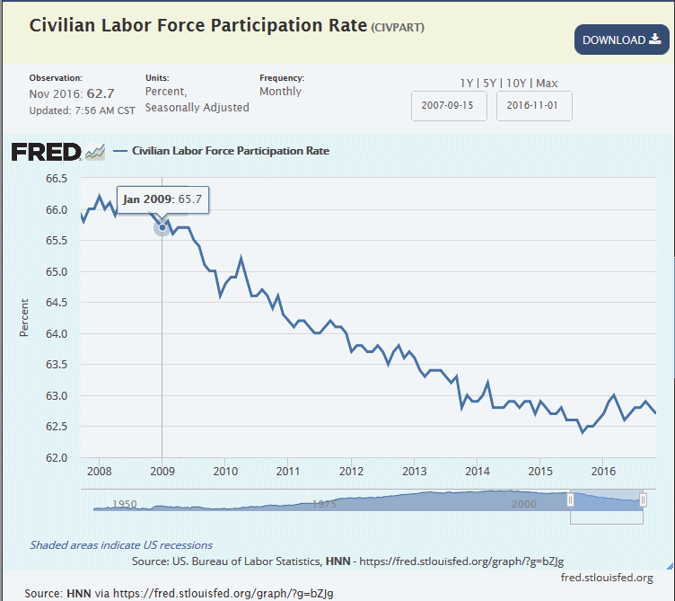
The percentage of the American public that are employed has dropped to a 62.7%.
Source: myf.red/g/bZJg
Not reflected in the corporate media reported unemployment rate are the tens of millions of Americans who are no longer employed since Obama took office.
These “forgotten” men and woman have not been able to find work in such a long time they are simply not considered part of the unemployment statistics because they are considered no longer looking for a job.
When Obama took office 65.7% of Americans were participating in the labor force which represents 213 million Americans participating in the work force when Obama took office.
The latest labor participation rate reported by the Federal Reserve is 62.7% which represents 203 million Americans currently participating in the work force.
That is 10 million Americans that are no longer participating in the work force.
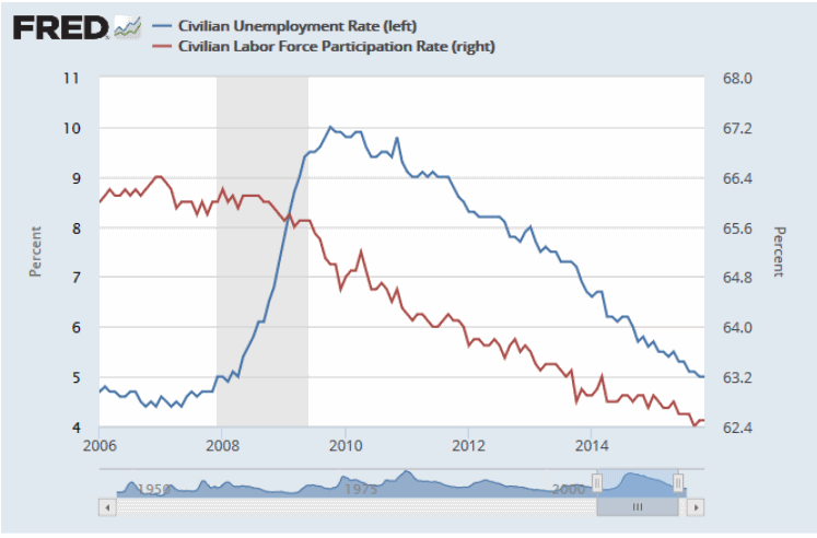
The chart below plots the officially reported unemployment number against the labor participation rate. which clearly shows a clear correlation between the drop in both rates.
Labor Share of Business
Labor’s share of business stands at all time lows with the latest Federal Reserve data reporting 98.287 at the end of the second quarter of 2015
Source: myf.red/g/bZSN
Before Obama took office labor’s share of income of the business sector stood at 103.528.
This measurement is often used to interpret “the worker’s share of the economy” dropped to an all-time low of 96.01 in the fourth quarter of 2011, a low which was tested again in 2012, 2013 and 2014.
Currently on an uptick, labor’s share of business income the 2015 second quarter is reported by the latest Federal Reserve data at 98.287 which is still lower than any other President in History.
Black Income
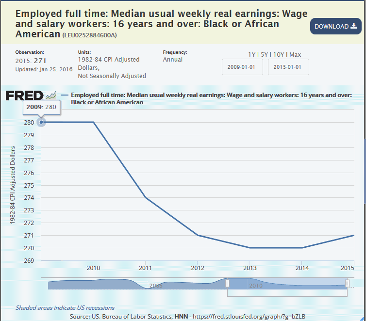
Median weekly income of Black or African Americans is $271 per week, according to the latest Federal Reserve Data down from $280 a week when Obama took office.
Source: myf.red/g/bZTw
The Federal Reserve reported the the median weekly income of black or African-American workers was $280 a week for 2009, which was the year Obama took office.
The average weekly income dropped to a low of $270 a week in 2013 and 2014 and has ticked up slightly to $271 a week in 2015, according to the latest Federal Reserve data.
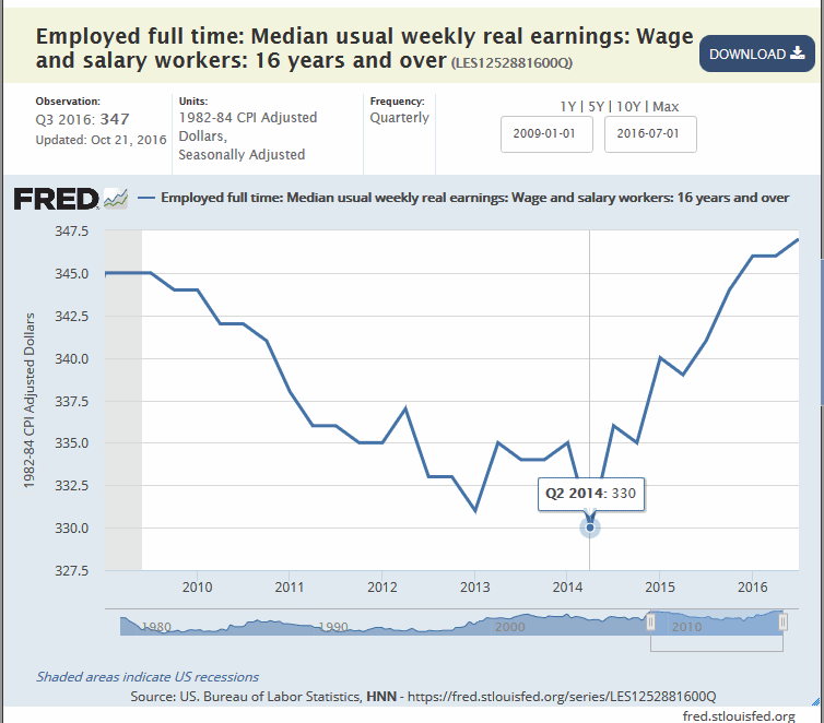
Compared to all media incomes, Obama began his administration with mean weekly earnings of $345 per week in the first quarter of 2009 which fell to a low of $330 per week in the second quarter of 2014.
According to the latest Federal Reserve data, the mean weekly weekly earnings have rebounded to $347 per week which is just $2 a week more than when Obama took office 8 years ago.
Home Ownership
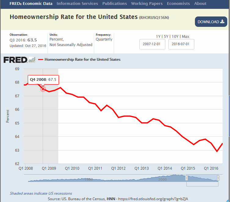
The Home ownership Rate under Obama fell under Obama to 63.5%.
Source: myf.red/g/bZU5
The Homeownership rate for the United States was at 67.5% for the last fiscal quarter of 2008, the last quarter before Obama .
Since then, the Homeownership rate fell to a low 62.9%, are rate only ever seen one other time in the history of the Federal Reserve’s data back in 1965.
According to the latest Federal Reserve data the Homeownership rate for the United States stands at 63.5% which ties for the second all-time low in history of the Federal Reserve’s data, which was last recorded over 30 years ago in the 4th Quarter of 1985.
Previous coverage:
Updated Data Sources via the Federal Reserve:
- Student Loans myf.red/g/bZMr
- Government owned Consumer Loans myf.red/g/bZHW
- Food Stamps myf.red/g/bZEj
- Federal Debt vs GDP- myf.red/g/2mCq
- Federal Debt – myf.red/g/bZPf
- Money Printing myf.red/g/bZDE
- Health Care Costs – myf.red/g/bZJc
- Labor Force Participation – myf.red/g/bZJg
- Non-Farm Business Sector – myf.red/g/bZSN
- Home Ownership – myf.red/g/bZU5
- Black Incomes – myf.red/g/bZTw
Additional Note: Zero Hedge has previously partially called out the so-called the Washington Post’s fact-checking by debunking one of the Washington Post’s biased claims. However, Zero Hedge then fell short leaving it to the reader to verify the data in the rest of the charts noting they could be verified by anyone with access to a Bloomberg terminal. Clearly that was a shot at the media, which would have such access, but that shot did little to settle any doubt that might be left in the minds of the reader.
So HNN has gone one step further to call out the Washington Post’s “fact check” by tracking down original official data sources publicly available to anyone on the internet. It has also been pointed out that previous, but out of date versions, of the charts of Obama’s accomplishments have bee posted on WND which themselves were updated versions of Zero Hedge’s charts and charts posted on the The Daily Caller. The HNN charts displayed below represent the most current Federal Reserve data at the time of this writing.
On Washington Post’s “fact-check”
Clearly, the news is under no obligation what so ever to tell the truth and as such every single corporate news outlet spend the entire election lying about Trump.
As such when someone with as much media influence as Donald Trump sends out a tweet with 9 little charts that completely tears to shred the lies the corporate media has been telling their liberal audiences for 8 years they need to step up and defend their fake reporting with more fake news to perpetuate their lies.
In summary, here’s how the Washington Post tried to discredit Trump, and hence Zero Hedge.
- Student Loans — The Washington posted claimed the nearly doubling of the student loan debt and the over $600 billion increase since Obama took office “isn’t a big spike.” That is a liberally biased opinion – not a fact being thrown against well a fact.
- Food Stamps — The Washington Post plays role of Obama apologist because he took office after the start of recession. This does not excuse the fact the liberal media has lied about a recovery and facts are facts- Food stamps continued to spike throughout the 8 years of Obama’s administration, regardless of the excuse, and continue to be paid out at record levels. This remaining underlying fact that still remains the same.
- Federal Debt — That Washington Post points out that Bush increased the debt by $2 trillion up to $11 trillion to deal with the Financial Crisis. This “fact-check” still doesn’t change the fact Obama took Bush’s one time stop-gap emergency measure and made it standard fiscal policy to the tune of $1 trillion nearly doubling the debt to what is current approaching $20 trillion. Furthermore, much of Obama’s spending has not been at all related to the financial crisis but instead doing to outrageous spending on items like massively increasing the size of the federal government, exorbitant expenditures on a failed health care system, and taking on debt to provide social and corporate welfare to prop up an economy that is failing do more to poor trade policies than anything else. The Washington Post failed to debunk any facts here but instead put forward excuses for Obama’s failure to accomplish a real economic recovery.
- Money Printing —The Washington Post played stupid hear claiming not to understand what “money printing” instead choosing to represent the term as literal printing of money, not dissimilar to how Hillary answered the question about wiping her private email server by responding “What, like with a cloth or something?” Money printing is a figure of speech describing the process of creating money out of thin air by increasing the Fed’s balance sheet or monetary base. Again, the Washington Post disproved nothing and the fact remains.
- Health Insurance Costs — The Washington Posted did nothing to correct facts about the original chart and instead displayed a chart of per-capita expenditures were rising. expenditures trending upward which if anything proves the point that Obama’s multi-trillion health care plan failed across the board at stemming the rampant rise in health care costs. The Washington Post also neglects to acknowledge that in addition to health care costs rising across the spectrum, Obama’s failed healthcare plan was also supposed to bring down the cost of health insurance but those prices too have continued to skyrocket as if Obama care was never enacted in the first place. So why are we paying tens of trillions of dollar for this plan again? Again the Washington Post failed to prove or correct any facts here and instead offered liberally biased apologies for another one of Obama’s failed accomplishments..
- Labor Force Participation — The Washington Post fails to debunk this chart as well. Instead, they point out the original chart was displayed a section of of the the vertical axis in what they claim is a “cheat” implying the graph is sensationalized. Regardless, the underlying data still remains a factor the the participation rate has clearly dropped under Obama and continues to do so. Moreover, the levels are depressed to rates not seen over the past 40 years. HNN, presents an altered graph above and further presents a cross section of the participation rate against the unemployment rate further showing how the official unemployment rate is being manipulated. The Washington Post again fails to put forth anything to change the facts.
- Zero Hedge’s original chart was labeled “Black Inequality” which displayed the Federal Reserve data on the “Workers’ Share of Economy” titled”Income Gini Ratio for Households by Race of Householder, Black Alone or in Combination.” That Washington Post engaged in the same tactic of changing the axis of the graph to a zero axis, a technique it accused Zero Hedge of using to “cheat” in doing this it made the data appear visually as if the increase was less than in Zero Hedge’s graph. Fact remains fact and the inequality has increased under Obama and using visual tricks to make it visually look like it isn’t as severe doesn’t change the underlying fact. To further exemplify this point HNN presents two graphs showing the real mean weekly income of everyone verse the real mean weekly income of blacks or African Americans which clearly show not only a judge wage gap between the demographs but that the black wages only recovered to a stagnate rate equivalent to 2009 levels while the other has increased. The Washington Post proved nothing wrong with the presented fact but instead offered up another excuse for Obama’s failed policies and attempted to deceive readers by visually deceiving them.
- Median Family Income — Here the Washington Post plays dumb again like they did in debunking the money printing chart claiming they couldn’t match the data in the Trump tweeted chart and they don’t know why while presenting their own graph. Another attempt to deceive the reader as Trump’s chart matches the Federal Reserve Chart exactly. Instead, the Washington post again altered the horizontal axis o to make the declines visually appear less severe. The Washington Post again failed to find anything wrong with the fact’s presented and instead tried to downplay another example of Obama’s failed policies.
- Home Ownership — The Washington Post offers up another apology for Obama by pointing out the decline started before Obama took office. Obama’s term is over. Obama failed to reverse the trend hence the discussion about Obama’s failed recovery. Blaming bush does not get Obama off the hook and the fact remains that the trend not only continued under Obama but has reached and still remains at all-time record low levels. Another so-called “fact-check” by the Washington Post which did not find anything nonfactual but instead apologized for Obama’s failed policies with partisan spin.
The Washington Post performed 9 fact checks and all 9 facts remain intact and failed to disprove a single claim. Trump and the alternative media win on every single item.
We can file the Washington Post article in the “Fake News” section of the Internet. As such, we expect Google, Facebook and Twitter to take immediately steps necessary to remove their articles from their networks and prevent the Washington Post from serving any ads on or supplied by their networks.
___
http://alexanderhiggins.com/11-charts-of-obama-accomplishments-trump-must-struggle-with/


