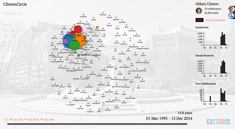
Clinton Circle: MIT just released a fantastic tool based on the Wikileaks emails. This is what Clinton’s ‘circle of trust’ looks like from her emails.
The MIT Media Lab created a visualization showing connections between the tens of thousands of emails sent by the candidate from a private server when she was secretary of state.
Clinton Circle, a new analysis made by the Macro Connections group from MIT Media Lab is the first graphic proposal that shows the relationships behind email interactions and also, facilitates reading these emails. Using a tool they had previously created called Immersion, researchers loaded nearly 30,000 private mails sent or received from the Hillary Clinton email address–which have already been published by WikiLeaks.
It all started early last week. Kevin Hu, one of my senior grad students, told me that a friend of his asked if we could use Immersion — an email visualization tool we had released in 2013 — to visualize Clinton’s Wikileaks email dataset.
The timing was not ideal for us. Kevin asked me this question when the Media Lab member event was getting started, which is a particularly busy time of the year. So my first question to Kevin was: “Can we?”
What made the project possible, besides Kevin’s amazing talents, was that we had reactivated the Immersion project a few weeks ago together with Jingxian Zhang, a new grad student in the group. Immersion had been paralyzed for two years since the students who had worked on it graduated. But Jingxian was now working to help complete the original vision of this project, and with her software engineering skills, visualizing the Wikileaks Clinton email dataset in Immersion was a possibility. So now that I knew we could do it, the question was: Should we?
Should questions are tough, especially when you need to consider a number of different variables. But before I tell you why I decided to move ahead with the project, I’ll try to make sure we are all on the same page about why this dataset is relevant.
The answer is quite simple, but also, not the one that you hear most often. Clinton’s emails are not relevant because they expose an alleged circle of corruption, or wrongdoing, as many conservatives claim. Her emails are also not irrelevant because they do not expose corruption or wrongdoing, as many liberals claim. These emails are relevant because Clinton was a person in charge of doing a security job, and anyone working on a security job is not supposed to communicate using an unsecured or unauthorized channel. This should be obvious, since each extra channel of communication increases the vulnerability of the system by increasing the probability that messages are intercepted. So the reason why Clinton’s emails are a big deal is because a person in charge of security should not be using an insecure channel, and those who argue from that perspective have a valid point.
Now, did Clinton actually reveal sensitive information? Whether she did or didn’t is a separate point from the one above, but also, one that we need to consider. Also, how are people supposed to learn about what was revealed in these messages? Should they blindly trust what the media tells them, or should they be allowed to evaluate this information themselves? And in a world where this information is already publicly available, but hard to digest, should we silence efforts that make this primary source of data available to citizens, or should we embrace them, as these efforts allow us to make our own conclusions by personally browsing the data?
For years I have created teams with unique capacities to make large datasets easy to understand. Earlier this year we released Data USA, the most comprehensive visualization of US public data. In 2013, we released a project visualizing the entire formal sector economy of Brazil (dataviva.info). My group also has been hosting a very popular tool to visualize international trade data (atlas.media.mit.edu) since 2011 (see chidalgo.com for a full list of projects). So in this environment, where I lead groups with the ability to make data easily digestible, and have a commitment to making data accessible so that people can explore it directly and make their own decisions, I decided that improving people’s ability to navigate a politically relevant dataset that was already publicly available was the right choice. My intuition was that, if you were going to spend 1, 5, or 10 minutes looking directly at these emails, you would get a slightly deeper understanding of what was in them if you used our interface rather than the ones that were presently available. I believe that these potential increases in depth, together with the creation of tools that allow people to explore primary sources of data directly, are a contribution. You may disagree with my choice, but I hope you at least understand it.
So what did we learn by making this dataset accessible?
We learned a few things about what Clinton’s emails said, about how the media works, and about how people interpreted the project.
We made clinton.media.mit.edu publicly available last Friday night (October 28, 2016). We launched with a single story, written by Alejandra Vargas from Univision.
My intuition was that the story was likely to get picked up by other news sources. After all, the tool facilitated people’s ability to read and understand the content of these emails, and the connections of the people involved in them. But I was wrong—it has been nearly a week since we released the project and no other major news source has picked up the story, despite having been viewed by more than 300,000 people in less than a week.
So how did we get so much traffic without any news coverage? The answer is social media. So far, the tool has been shared widely on Twitter, Facebook, and for a brief but intense time, on Reddit. Its spread has been fueled by different motives, and also, has been battled in different ways.
Many reporters shared the news on their personal accounts understanding that the tool represents a different form of data reporting, or data journalism: one where people are provided with a tool that facilitates their ability to explore a relevant dataset, instead of being provided with a story summarizing a reporter’s description of that dataset.
Another group of people that shared the news were interface designers, who understand that there is a need to improve the tabular interface of present day email clients, and that the inbox we presented in this project was an attractive new alternative.
But many people also shared our site claiming that this was evidence of Clinton’s corruption, and that the site supported Trump. More on that later.
But the spread of the site was not without its detractors. A few hours after we released the site I received a message from a friend telling me that what I had done was “a huge mistake” and that I should have waited to post this until “later in the year.”
A few days later, outside my lab, a member of a neighboring research group called me a “Trump supporter” and told me that I should have only made that site available if it also included Trump’s emails. I told him that I would be happy to include them, but I had no access to the data. In haste, this colleague began emailing me news articles, none of which provided access to the alleged public dataset of Trump emails.
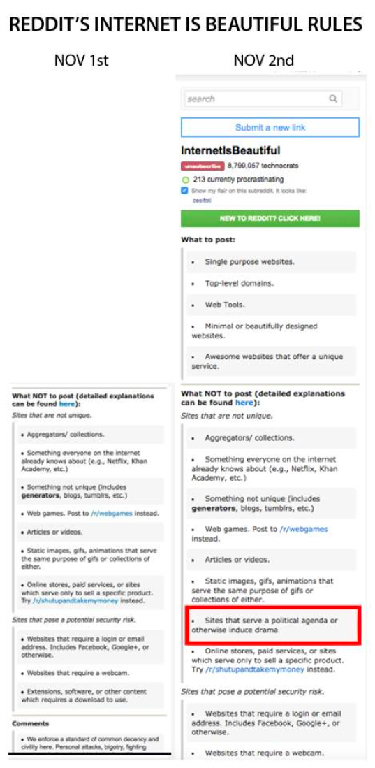
Later, a friend of one of my students posted the news on Reddit, where it went viral. And I mean really viral. It became the top story of the Internetisbeautiful subreddit, and made it to Reddit’s front page. It collected more than 3,000 upvotes and 700 comments. But as the story peaked, a moderator single-handedly removed it in an authoritarian move, and justified this unilateral silencing of the post by adding a rule banning “sites that serve a political agenda or that otherwise induce drama.” Of course, the rule was added AFTER the post was removed.
So when it comes to media, social or not, I learned that providing information directly to people so that they can inspect it and evaluate it, is a value that many people consider second to supporting their preferred electoral choice. The twist is that I don’t support Trump. In fact, I don’t support him at all. I think he is potentially a threat to global security, and also, a candidate that has shown repeatedly to be a dividing rather than unifying force. He has failed to respect contracts numerous times, defrauding contractors; and he certainly has shown little respect for people’s development by creating a fraudulent university. So I think he is ill prepared for most jobs, including a difficult one like that of being president.
I support Clinton in this election, and even though I don’t get to vote (As a green card holder I just pay taxes), I want her to win next Tuesday. I really do. But I understand that this is my own personal choice, a choice that I want to make sure is informed by my ability to evaluate information about the candidates directly, and by a media that is more transparent than the one we now have. Trust me, if I had Trump’s tax records, I would also think it is a good idea to make a tool that makes them more easily digestible. But my reason to make that tool, once again, would not come from my support for Clinton, or my opposition to Trump. It would come from my support for a society where people have direct access to relevant sources of information through well-designed data visualization tools.
So what did I learn about Clinton’s emails? One of the advantages of helping design a data visualization tool is that you get an intimate understanding of the data you are visualizing. After all, you have to explore the data and use the tool to make dozens of design decisions. In this case, the development cycle was particularly fast, but nevertheless I got to learn a few things about the data.
Of course, the whole point of making this tool is that you can use it to come up with your own interpretation of the data. That said, you might be curious about mine, so I’ll share it with you too.
What I saw on Clinton’s emails was not surprising to me. It involved a relatively small group of people talking about what language to use when communicating with other people. Also, it involved many unresponded-to emails. Many conversations revolved around what words to use or avoid, and what topics to focus on, or how to avoid some topics, when speaking in public or in meetings. This is not surprising to me because I’ve met many politicians in my life, including a few presidents and dozens of ministers and governors, so I know that what work means to many people in this line of work, on a daily basis, is strategizing what to say and being careful about how to say it. I am sure that if we had access to Trump’s emails we would see plenty of the same behavior.
So what I got from reading some of Clinton’s email is another piece of evidence confirming my intuition that political systems scale poorly. The most influential actors on them are spending a substantial fraction of their mental capacity thinking about how to communicate, and do not have the bandwidth needed to deal with many incoming messages (the unresponded-to emails). This is not surprising considering the large number of people they interact with (although this dataset is rather small. I send 8k emails a year and receive 30k. In this dataset Clinton is sending only 2K emails a year).
Our modern political world is one where a few need to interact with many, so they have no time for deep relationships — they physically cannot. So what we are left is with a world of first impressions and public opinion, where the choice of words matters enormously, and becomes central to the job. Yet, the chronic lack of time that comes from having a system where few people govern many, and that leads people to strategize every word, is not Clinton’s fault. It is just a bug that affects all modern political systems, which are ancient Greek democracies that were not designed to deal with hundreds of millions of people.
On another note, this exercise also helped me reaffirm my belief that the best way to learn about the media is not by reading the news, but by being news. I’ve had the fortune, and misfortune, to have been news many times. This time, I honestly thought that we had a piece of content that some media channels would be interested in and that it would get picked up easily. I have many reporter friends who are enthusiastic about new forms of data journalism, and that actually have been positive and encouraging this week. So I imagined that there was a good chance that a reporter would see the site, go to his or her editor, and say: “Hey, I have an interactive data visualization of all Clinton’s emails. Can I write a story on it?” and the editor would say: “Of course, make it quick.” I don’t know if these conversations actually happened, but given the large volume of traffic our project received I would be surprised if they didn’t. I learned that the outcome was not the one I intuited.
And this brings me to my final point, which is that while I support Clinton in this election, and I think Trump is a bad choice for president (a really bad one), I still think that we should work on the creation of tools that improve the ability of people to personalize scrutinize politically relevant information. I now understand that much of the U.S. media may not share that view with me, and that I think this is an important point of reflection. I hope the media takes some time to think about this on November 9 (or the week after).
Also, the large number of people who were unable to interpret our tool as anything but an effort to support or oppose a political candidate — and that was true for both liberals and conservatives — speaks to me about an ineffective public sphere. And that’s something I think we should all be concerned about. This polarization is not just a cliché. It is a crippling societal condition that is expressed in the inability of people to see any merit, or any point, in opposing views. That’s a dangerous, and chronic, institutional disease that is expressed also in the inability of people to criticize their own candidates, because they fear being confused with someone their peers will interpret as a supporter of the opposing candidate. If you cannot see any merit in the candidate you oppose, even in one or two of the many points that have been made, you may have it.
So that’s how this election has muddled the gears of democracy. When we cannot learn from those we oppose, or agree when they have a valid point, our learning stops. We keep on talking past each other. I know that this election has made learning from those we oppose particularly difficult, but the difficult tests are the ones that truly show us what we are really made of. These are the situations that push us to see past all of the things that we don’t like, or don’t agree on, so we can rescue a lesson. You may not agree with me, but I hope at least I gave you something to think about.
César A. Hidalgo is associate professor of media arts and sciences at the MIT Media Lab and the author of Why Information Grows: The evolution of order from atoms to economies. He has also lead the creation of data visualization sites that have received more than 100 million views, including datausa.io, dataviva.info, atlas.media.mit.edu, immersion.media.mit.edu, pantheon.media.mit.edu, streetscore.media.mit.edu, and others (see chidalgo.com for more details).